
Google Pay Brand Operating System
The Google Pay Brand Operating System was built in a series of related projects. The effort began with the creation and alignment of global brand standards, global creative campaigns, and logo development. It grew to include core product and brand architecture, a new product line strategy, conceptual development for the core product and a future vision for the Google Pay ecosystem.
Redefining a brand
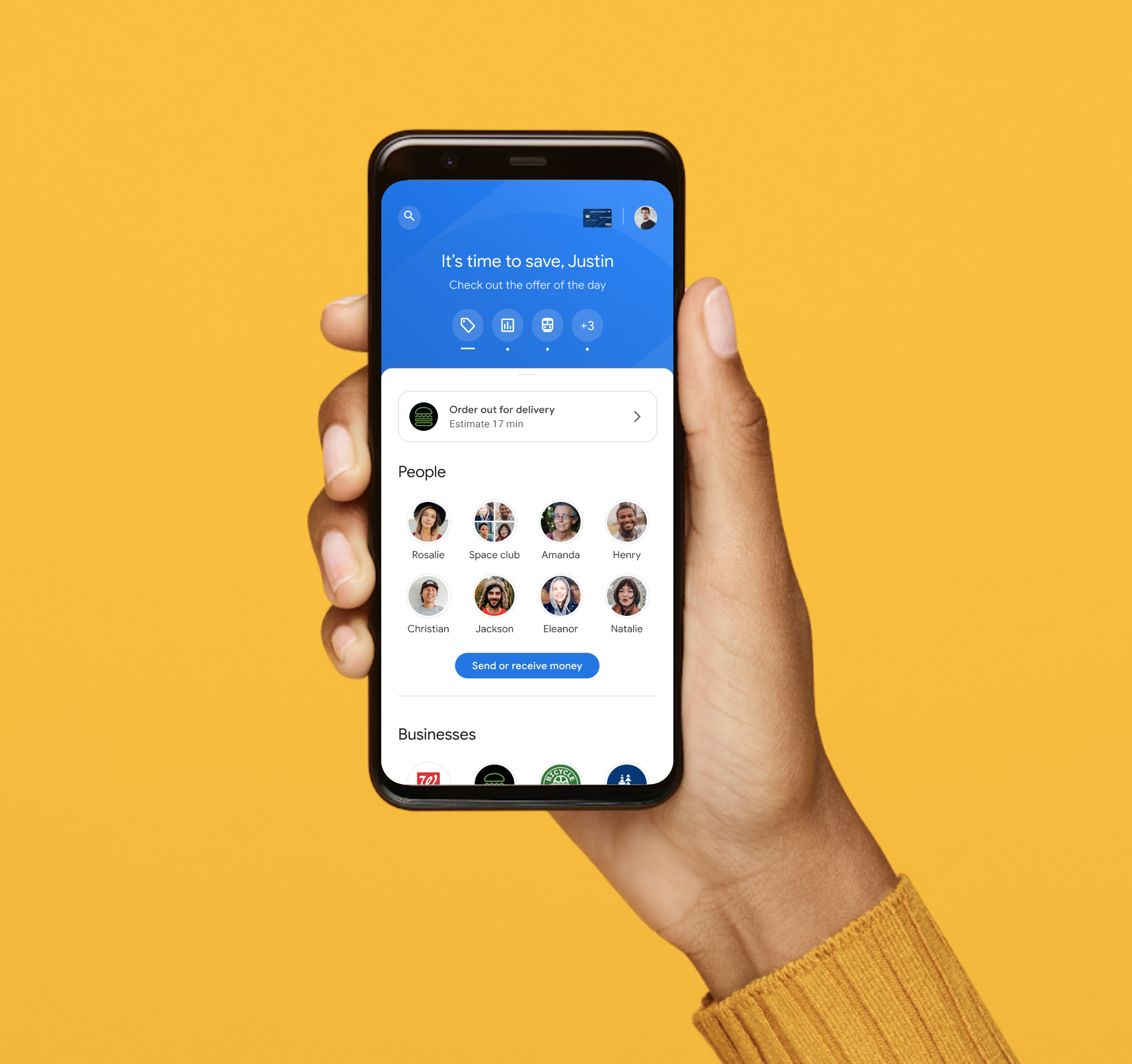
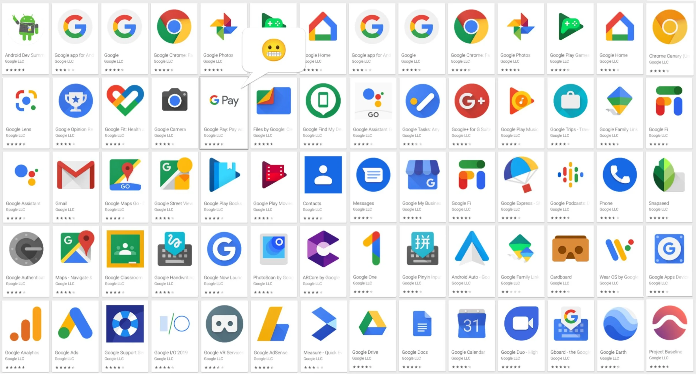
Like all Google products, the payment product ecosystem is a moving target. Individual payment products had been introduced organically by Google and Android alike. What was Google Checkout, Google Wallet, Android Pay, and Google Tez, became Google Pay.
We needed to create well-defined scope to be successful. To create a solid foundation for Google Pay to grow on, we focused on unifying the brand & product architecture around the customer and merchant apps and payments touchpoints as the core of the Google Pay brand. Clear lanes for branding were created to accommodate new experiments, features, and future products as they come online.
Related products and features outside of the Google Pay core are simplified to keep product metaphors easily understandable. Previously branded products such as Google Pay Wallet, simply become Wallet, a digital hub for storing payment methods, IDs, passes, keys, and more.
A platform for opportunity
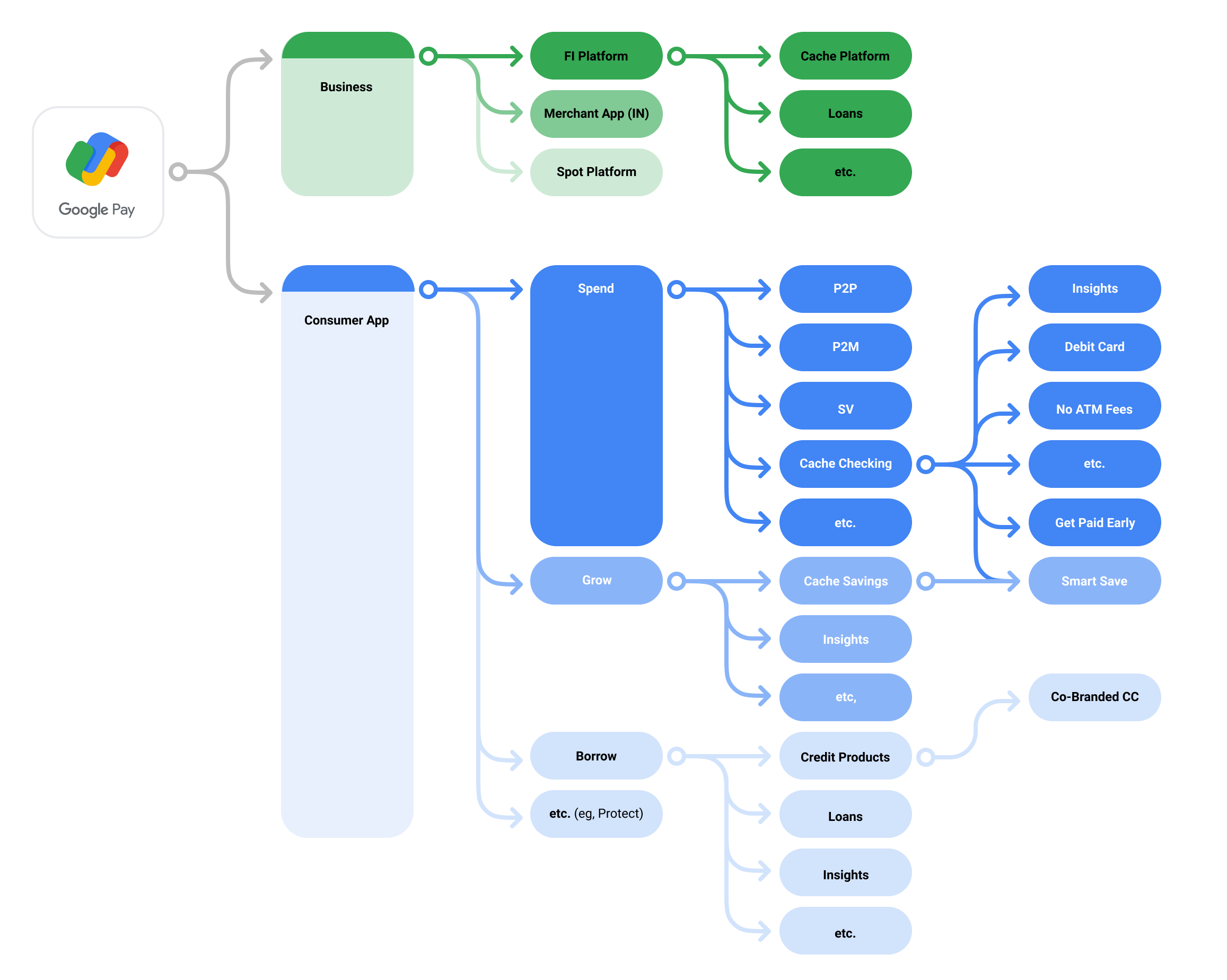
We created a north star as a unifying aspiration for future product development. Google Pay is Google’s approach to the future of money and payments. Like Android and YouTube, it is more than a product, it’s a platform built to empower users, merchants, and financial institutions.
Payments is the core of the offering, but Google Pay is designed to transform the world’s relationship with money, from insights to financial planning, to loans, to insurance, to investments, to financial literacy. It exists as an app but is also accessible in other places on your phone and across the web, and in person. Google Pay is designed to unlock opportunity by making money simple, helpful, and accessible to everyone.
Launching the Brand
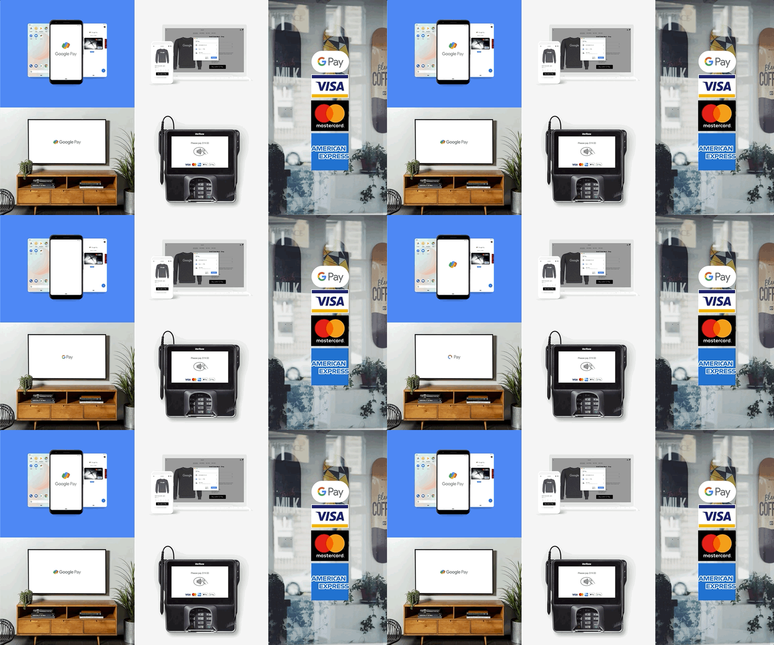
Oriented around 15-second spots, the new Google Pay was announced in Singapore with a quick hit campaign created to inform audiences about the product's capabilities. The system was echoed in public transportation centers and outside of movie theaters to bring the value proposition to point of sale.
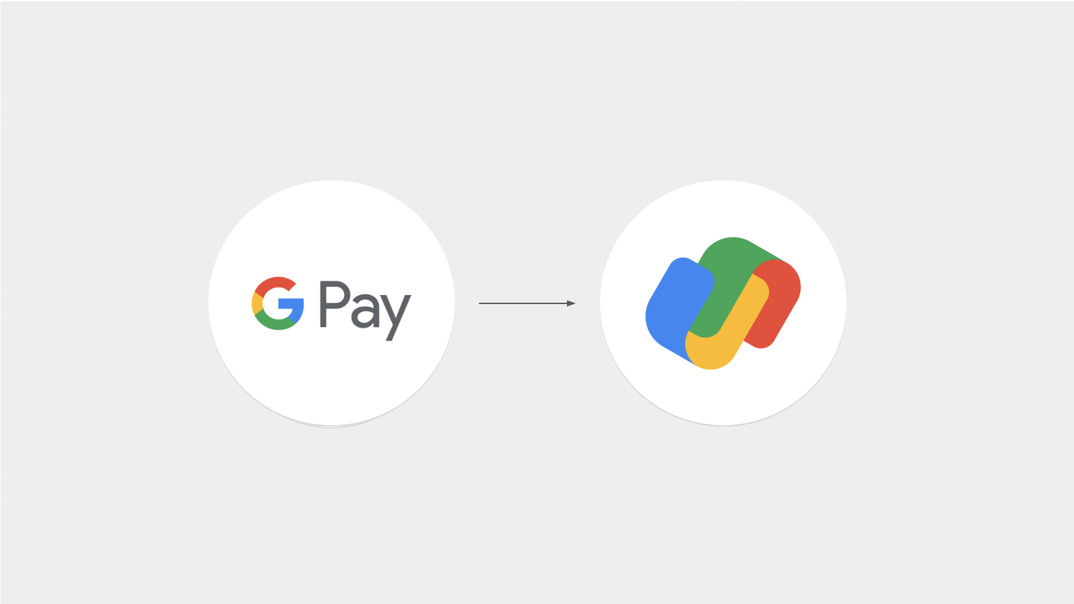
redesigning the brand icon
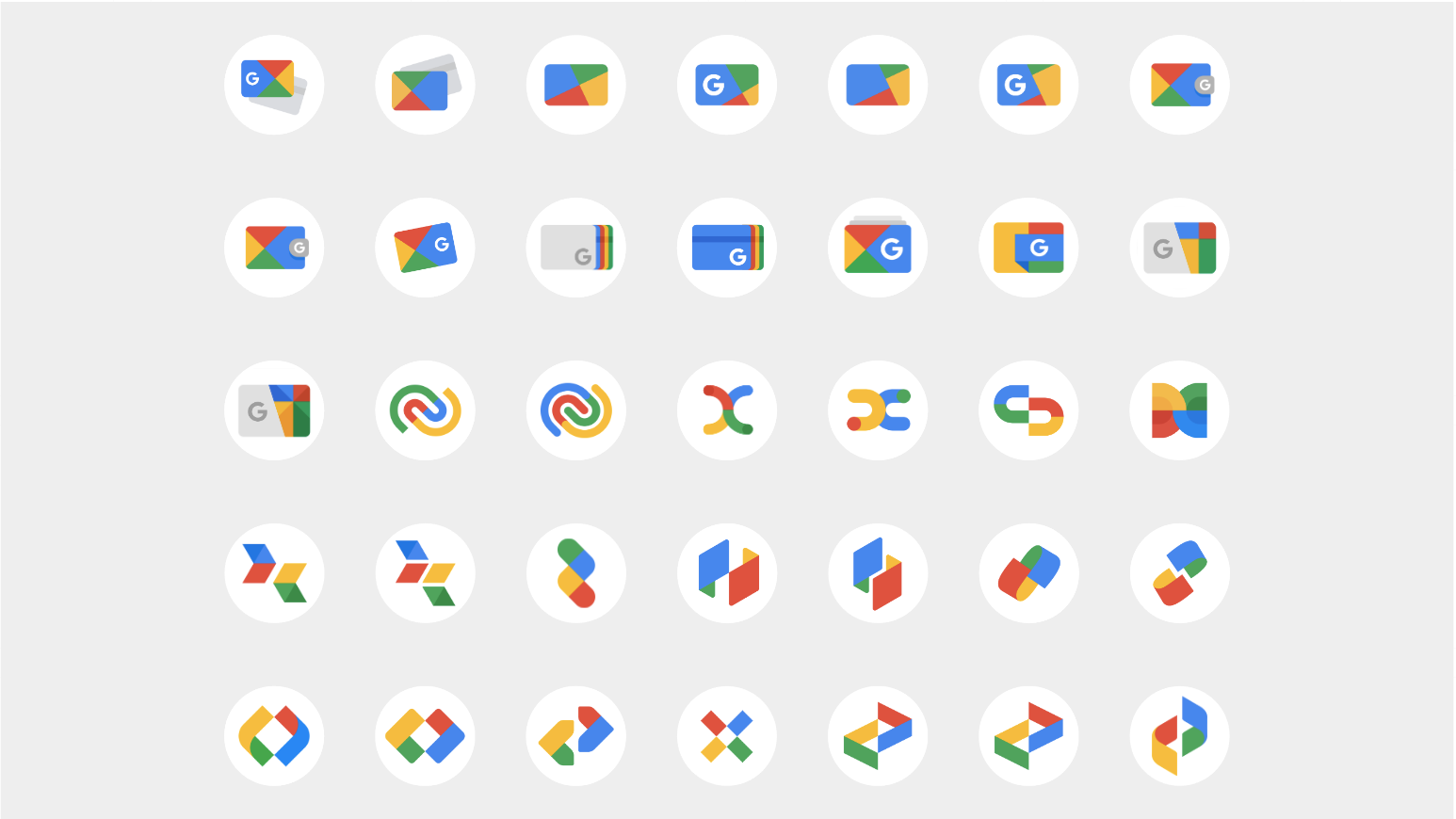
The old Google Pay brand mark had aged out of the current Google flagship product ecosystem and violated a number of governing rules the Google Brand studio had put into place around product icons. The new mark had to speak above the din of a crowded financial products landscape, representing both transactions and our relationship with money. And, it needed to work everywhere from the drive-thru window cling to the glyph in your phone’s system tray.

Setting the standard
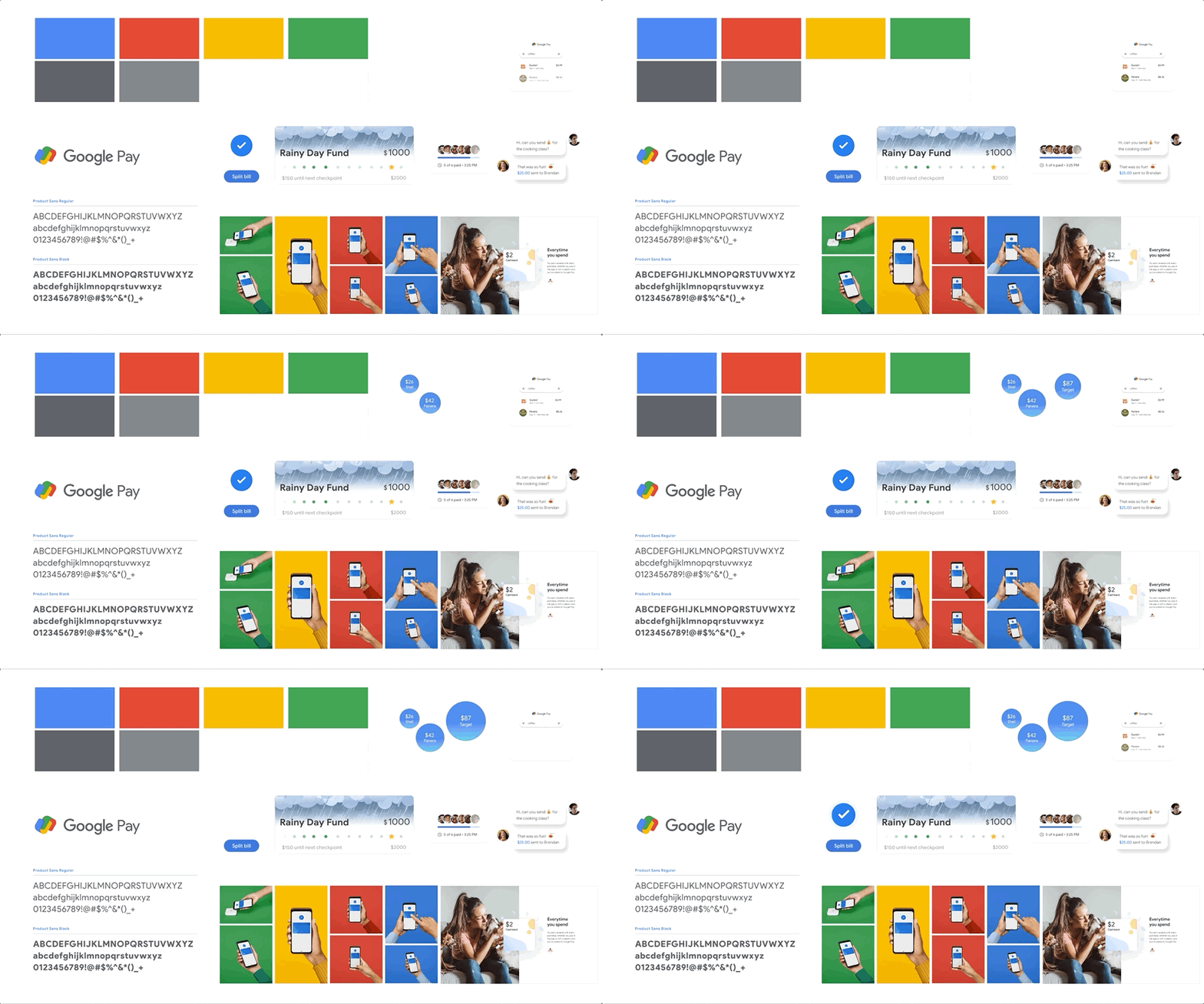
The Google Pay Global Brand Standards are designed to cover everything you need to know to develop creative projects within the Google Pay brand ecosystem. The standards support the needs of multiple audiences ranging from business, strategy, and planning to creative and interactive teams.

Going BIG
The new Google Pay was launched for US audiences through a series of brand spots designed to show off the app udpate and teach users what the product could do. It was supported in NYC with an OOH campaign and a subway takeover.